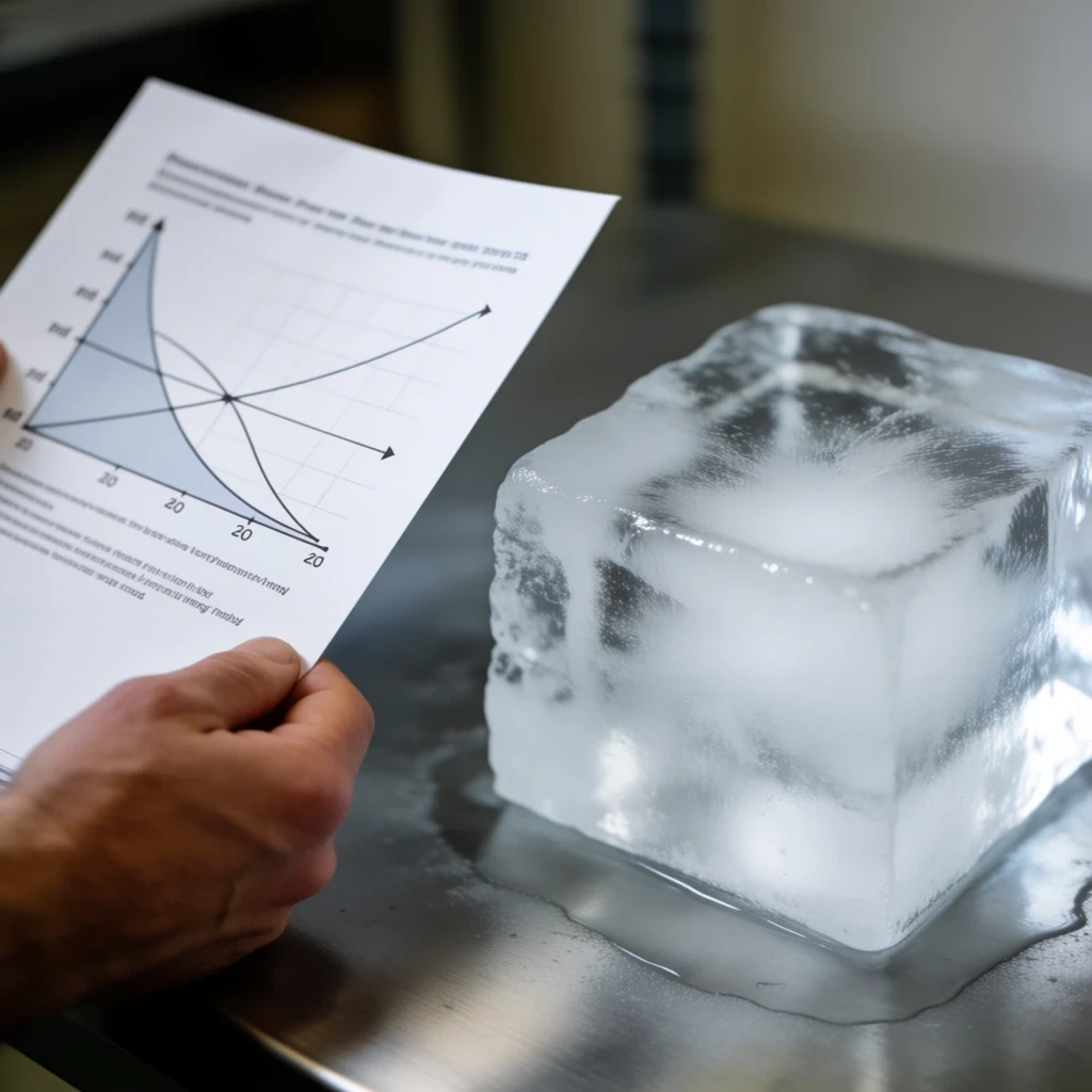
A phase diagram is far more than a decorative chart pinned to a thermodynamics lecture slide. It is a compressed map of matter's behavior, encoding the precise conditions of temperature and pressure under which a substance exists as solid, liquid, gas, or something far stranger. Learning to read one fluently transforms a static drawing into a predictive instrument, one that tells you what happens when you heat a crystal, compress a gas, or push a material toward the edge of stability. Physicists treat these diagrams as working tools, not illustrations, and that habit is worth acquiring.
The skill pays dividends across an astonishing range of disciplines. A metallurgist consults phase diagrams to design alloys that resist cracking; a planetary scientist uses them to model the interior of Europa or the atmosphere of Titan; a chemist reads them to choose crystallization conditions. Even the exotic quantum phases studied in modern condensed-matter labs obey the same geometric logic of boundaries, triple points, and critical endpoints. Once you internalize the grammar of these maps, unfamiliar diagrams in research papers stop looking like cryptic scribbles and start reading like sentences.
This guide walks through the anatomy of a phase diagram using water as the familiar anchor, then generalizes the method so you can decode any diagram you encounter. We will examine the meaning of the axes, the significance of boundary lines, the peculiar physics of triple and critical points, and the subtle territory of metastability where diamonds and supercooled liquids live. Along the way, quantitative relationships such as the Clausius–Clapeyron equation will ground the geometry in real physics, giving you both intuition and calculation.
On This Page
- The Anatomy of a Phase Diagram: Axes, Regions, and Boundaries
- Triple Points, Critical Points, and the Topology of Coexistence
- Metastability, Supercooling, and the Territory Beyond Equilibrium
- Beyond Pressure and Temperature: Multicomponent and Exotic Diagrams
- A Practical Protocol for Reading Unfamiliar Diagrams
- Worked Calculations: Ten Quantitative Exercises in Phase Reading
- Why This Skill Matters Beyond the Laboratory
The Anatomy of a Phase Diagram: Axes, Regions, and Boundaries
Every phase diagram begins with a coordinate system, and the choice of axes carries physical meaning. The most common version plots pressure on the vertical axis against temperature on the horizontal axis, producing the familiar ##[P\text{–}T]## map. Other variants swap in volume, composition, or magnetic field, but the interpretive logic remains identical: each region of the plane corresponds to a stable phase, and each boundary marks conditions where two phases coexist in equilibrium.
Reading the Coordinate System and Stable Regions
The regions themselves are the easiest feature to read, yet they reward careful attention. A point falling inside the solid region means the solid is the thermodynamically stable form at that temperature and pressure; the liquid and gas regions follow the same rule. Stability here is a statement about free energy, not about kinetics, so a system sitting in a stable region will remain there indefinitely unless conditions change.
Boundary lines deserve equal scrutiny because they encode coexistence. Along the melting curve, solid and liquid coexist at a single temperature for a given pressure, and the slope of that line reveals whether the solid is denser or less dense than its liquid. Water's melting curve leans backward, a famous anomaly reflecting ice's lower density, while most substances show a forward-leaning melting line.
The sublimation curve, separating solid from gas, and the vaporization curve, separating liquid from gas, complete the typical set of three boundaries. Each terminates at a special junction, and the way these lines meet or end tells you almost everything about the substance's character. A diagram with a short vaporization curve, for instance, hints at a low critical temperature and a substance that is hard to liquefy.
Orientation matters as much as shape. A steep vaporization curve means pressure must rise sharply to change the boiling point, which signals a large enthalpy of vaporization relative to the molar volume change. Reading these slopes as physical statements, rather than mere geometry, is the first habit that separates a physicist's reading from a casual glance.
Slopes, Clausius–Clapeyron, and Quantitative Reading
The slope of a coexistence curve is not arbitrary; thermodynamics fixes it through the Clausius–Clapeyron relation. For a first-order transition, the pressure derivative of the transition temperature is set by the entropy and volume changes across the boundary. This equation converts a visual feature, the tilt of a line, into a measurable physical quantity, which is precisely the kind of translation physicists love.
Here ##[L]## is the latent heat of the transition, ##[T]## the transition temperature, and ##[\Delta V]## the change in molar volume. For vaporization, the gas volume dwarfs the liquid volume, so the slope is large and positive, producing the steep vaporization curves we observe. For melting, the volume change is small and can even be negative, as in water.
Applying the equation to water's melting curve explains the backward tilt. Ice has a larger molar volume than liquid water, so ##[\Delta V]## is negative while ##[L]## is positive, making ##[dP/dT]## negative. Increase the pressure and the melting temperature drops, which is why ice skates glide on a thin meltwater film under pressure, though friction contributes too.
Worked example: for water at ##[273.15\ \text{K}]##, take ##[L = 6.01\ \text{kJ/mol}]## and ##[\Delta V = -1.63\times10^{-6}\ \text{m}^3/\text{mol}]##. Then ##[dP/dT = 6010 / (273.15 \times -1.63\times10^{-6}) \approx -1.35\times10^{7}\ \text{Pa/K}]##, roughly ##[-134]## atmospheres per kelvin, a steep negative slope consistent with the diagram.
Triple Points, Critical Points, and the Topology of Coexistence
Where boundaries meet, the diagram's topology becomes physically eloquent. Two special junctions dominate the landscape: the triple point, where three phases coexist simultaneously, and the critical point, where a coexistence line simply ends. Understanding these two features unlocks the deeper structure of the map and explains phenomena that seem, at first glance, to defy ordinary phase logic.
The Triple Point as a Thermodynamic Lock
At the triple point, three phases share a single temperature and pressure, and the Gibbs phase rule explains why this is a unique point rather than a region. For a pure substance with one component, the rule ##[F = C - P + 2]## gives ##[F = 0]## when three phases coexist, meaning no thermodynamic freedom remains. Temperature and pressure are locked to fixed values.
Water's triple point sits at ##[273.16\ \text{K}]## and ##[611.657\ \text{Pa}]##, a definition so precise that it once anchored the kelvin scale. This is not a curiosity but a metrological foundation: the triple point provides a reproducible fixed point for calibration because it depends only on the substance, not on how much of it you have.
Triple points also appear in more complex diagrams, including those of alloys and quantum materials. In a binary system, the phase rule permits a triple point at a specific composition and temperature, and such points govern phenomena like eutectic melting. Reading them requires tracking composition as an additional axis, but the underlying logic of locked variables persists.
Practical example: freeze-drying exploits the triple point by lowering pressure below ##[611.657\ \text{Pa}]## so that ice sublimates directly to vapor, bypassing the liquid phase entirely. The diagram tells you exactly where to operate, and the process works because the operating point sits on the sublimation curve, not in the liquid region.
The Critical Point and the End of Distinction
The critical point marks the terminus of a coexistence line, beyond which the distinction between two phases vanishes. At the liquid–gas critical point, the densities of liquid and gas converge, the latent heat falls to zero, and the interface disappears. Beyond it lies a single supercritical fluid, neither liquid nor gas but something continuous between them.
For water, the critical point lies at ##[647.1\ \text{K}]## and ##[22.06\ \text{MPa}]##, conditions reached in supercritical power plants and hydrothermal synthesis reactors. For carbon dioxide, the values are a modest ##[304.1\ \text{K}]## and ##[7.38\ \text{MPa}]##, which is why supercritical ##[\text{CO}_2]## serves as a gentle extraction solvent for decaffeinating coffee and extracting essential oils.
The critical point's physics is captured by critical exponents and universality, concepts that connect boiling water to ferromagnets near their Curie temperature. Near the critical point, correlation lengths diverge and fluctuations span all scales, producing phenomena like critical opalescence, where a normally clear fluid scatters light dramatically. The phase diagram's endpoint is thus a gateway to some of the richest physics in statistical mechanics.
Reading a critical point on an unfamiliar diagram is straightforward once you know the signature: a coexistence line that simply stops, with no continuation into another boundary. If you see a line ending in mid-plane, you are looking at a critical point, and the region beyond it is a single phase whose properties vary continuously.
Metastability, Supercooling, and the Territory Beyond Equilibrium
Phase diagrams describe equilibrium, but real materials often linger in states the diagram says should not exist. Supercooled water can remain liquid far below its freezing point, and diamond persists at room temperature despite graphite being the stable form of carbon. These are metastable states, and reading them requires understanding that the diagram's regions describe where a phase is stable, not where it is the only possible state.
Supercooling and the Kinetics of Phase Change
Supercooling occurs when a liquid is cooled below its freezing point without crystallizing, because nucleation of the solid phase requires overcoming an energy barrier. The phase diagram still shows the solid as stable, but the system is trapped in a local free-energy minimum. Given a nucleation site or sufficient time, it will transform, sometimes violently.
The metastable extension of the vaporization curve, drawn as a dashed line beyond the triple point, represents superheated liquid or supersaturated vapor. These extensions are not physical equilibrium boundaries but guides to where metastable states can exist. Reading them correctly means recognizing dashed lines as kinetic territory rather than thermodynamic law.
Supercooled water is a dramatic example: it can persist down to about ##[231\ \text{K}]## before homogeneous nucleation intervenes, well below the equilibrium freezing point of ##[273.15\ \text{K}]##. The phase diagram's melting curve does not move; the system simply refuses to cross it without help. This distinction between stability and accessibility is central to materials science.
Practical consequence: cloud seeding and crystallization control both exploit metastability. By introducing nucleation sites, you can trigger transformation at conditions where the diagram predicts the new phase is stable but the system has not yet found it. The diagram tells you the destination; kinetics determines the journey.
Diamond, Graphite, and Pressure-Temperature Reality
Carbon's phase diagram places the diamond–graphite boundary at pressures of several gigapascals at room temperature, meaning graphite is stable under everyday conditions. Diamond persists because the transformation requires breaking and rebuilding an entire covalent lattice, a process with an enormous kinetic barrier. The diagram explains why diamonds are metastable, not why they last, and that distinction matters.
Reading unfamiliar diagrams in research papers often involves exactly this kind of reasoning. A phase labeled "metastable" or drawn with a dashed boundary signals that kinetics, not thermodynamics, governs the observed state. Physicists learn to check whether a reported phase sits in a stable region or a metastable pocket before accepting claims about its behavior.
Quantitative check: the free-energy difference between diamond and graphite at ambient conditions is small, roughly ##[2.9\ \text{kJ/mol}]##, which is why the barrier, not the energy gap, controls persistence. A modest energy input can overcome the barrier, which is why diamonds can burn and why they are not forever in a thermodynamic sense.
This metastability lens extends to exotic quantum phases, where systems can be trapped in states that are not the global ground state. Reading those diagrams requires the same discipline: identify the stable regions, note the dashed extensions, and ask what kinetics permits. The map is a guide, not a guarantee.
Beyond Pressure and Temperature: Multicomponent and Exotic Diagrams
Not every phase diagram fits on a two-dimensional page. Alloys, ceramics, and quantum materials often require additional axes for composition, magnetic field, or chemical potential. The reading strategy scales, but the visual grammar changes, and recognizing the new conventions is essential for interpreting modern research literature.
Binary and Ternary Diagrams in Materials Science
In a binary alloy diagram, the horizontal axis is composition and the vertical axis is temperature, with pressure fixed. Regions show which phases coexist, and the lever rule lets you calculate the fractions of each phase present at a given overall composition. This is the workhorse diagram of metallurgy, and reading it fluently is a professional necessity.
Ternary diagrams add a third component, plotted on a triangular grid where each corner represents a pure substance. Reading them requires locating a composition point and tracing tie lines to determine coexisting phases. The geometry is more demanding, but the underlying principle, that regions map stable assemblages, remains unchanged.
Worked example: consider a binary system with a eutectic point at ##[x = 0.4]## and ##[T = 500\ \text{K}]##. An alloy of overall composition ##[x = 0.3]## cooled slowly will first precipitate the ##[\alpha]## phase, then at the eutectic temperature the remaining liquid transforms into a lamellar mixture of ##[\alpha]## and ##[\beta]##. The diagram predicts the sequence precisely.
These diagrams also reveal processing windows. A narrow single-phase region means small composition changes push the alloy into a two-phase field, which affects strength and corrosion resistance. Reading the width of regions, not just their existence, is how materials scientists extract design guidance from the map.
Quantum Phase Diagrams and the Modern Frontier
Quantum phase diagrams replace temperature with a nonthermal tuning parameter, such as magnetic field, pressure, or doping. At zero temperature, quantum fluctuations drive transitions between ground states, and the diagram maps which phase wins for each parameter value. These diagrams are central to research on superconductors, quantum magnets, and topological materials.
Reading a quantum phase diagram requires attention to quantum critical points, where a continuous transition occurs at zero temperature and influences a fan of finite-temperature behavior above it. The diagram's axes may be unfamiliar, but the logic of regions, boundaries, and singular points carries over directly from the classical case.
Example: in a heavy-fermion system, tuning a magnetic field can suppress magnetic order at a quantum critical point, and the surrounding region shows non-Fermi-liquid behavior. The diagram encodes this as a boundary ending at zero temperature, with a shaded fan indicating the critical regime. Recognizing that fan is the key interpretive move.
These exotic diagrams reward the same disciplined reading: identify the axes, locate the stable regions, find the singular points, and check whether boundaries are solid or dashed. The physics is unfamiliar, but the cartographic grammar is the same one you learned from water.
A Practical Protocol for Reading Unfamiliar Diagrams
Faced with an unfamiliar phase diagram in a research paper, a physicist follows a repeatable protocol. The steps are simple but disciplined, and they convert a confusing figure into a structured source of information within minutes. Mastering this routine is the difference between skimming a figure and genuinely reading it.
Step-by-Step Decoding of a New Diagram
First, identify the axes and their units. Confirm whether the vertical axis is pressure, temperature, or something else, and check the scale, since logarithmic axes are common. Second, locate the labeled regions and confirm which phase each represents, noting any unfamiliar labels such as "nematic" or "supercritical fluid."
Third, trace the boundaries and classify them as solid or dashed. Solid lines indicate equilibrium coexistence; dashed lines signal metastable extensions or estimated boundaries. Fourth, find the singular points, including triple points and critical points, and note where lines terminate or meet.
Fifth, check the slopes of coexistence curves and connect them to physical quantities using the Clausius–Clapeyron relation. Sixth, ask what the diagram implies for the experiment described in the paper, such as which phase is stable at the reported conditions. This final step converts reading into interpretation.
Worked example: suppose a paper reports a transition at ##[T = 300\ \text{K}]## and ##[P = 1\ \text{GPa}]##. Locate that point on the diagram; if it falls in a region labeled "phase II," the reported state is consistent. If it falls on a dashed line, the authors are claiming a metastable state, and you should scrutinize their kinetic evidence.
Common Pitfalls and How to Avoid Them
A frequent error is confusing stability with existence. A phase can exist outside its stable region, as supercooled water demonstrates, so a point in the "wrong" region does not invalidate an observation. Always ask whether the reported state is equilibrium or kinetically trapped before drawing conclusions.
Another pitfall is misreading logarithmic axes, which compress large ranges and can make slopes look gentler than they are. Check the axis labels carefully, and when in doubt, compute the actual slope from the numerical values rather than eyeballing the figure. Precision here prevents serious misinterpretation.
A third trap is ignoring the phase rule when interpreting multicomponent diagrams. In a binary system at fixed pressure, three coexisting phases require a specific temperature, not a range. If a figure seems to show three phases over a temperature interval, re-examine the axes and the assumptions.
Finally, remember that phase diagrams are models, often computed from thermodynamic databases rather than measured point by point. Their accuracy varies, and regions near boundaries can be uncertain. Reading critically means noting the source of the diagram and treating it as a guide to be tested, not an infallible oracle.
We Also Published
Worked Calculations: Ten Quantitative Exercises in Phase Reading
Fluency in reading phase diagrams ultimately rests on quantitative practice. The following ten exercises move from simple slope estimates to critical-point scaling, each illustrating a different interpretive skill. Working through them cements the connection between the visual map and the underlying thermodynamics.
From Clausius–Clapeyron to Critical Scaling
Exercise 1: estimate the slope of water's vaporization curve at ##[373\ \text{K}]## using ##[L = 40.7\ \text{kJ/mol}]## and ##[\Delta V \approx 30.1\ \text{L/mol}]##. Convert to SI and compute ##[dP/dT = 40700 / (373 \times 0.0301) \approx 3.6\ \text{kPa/K}]##, a steep positive slope consistent with the diagram.
Exercise 2: for a substance with ##[L = 20\ \text{kJ/mol}]## and ##[\Delta V = 0.02\ \text{m}^3/\text{mol}]## at ##[T = 400\ \text{K}]##, find ##[dP/dT = 20000 / (400 \times 0.02) = 2500\ \text{Pa/K}]##. This moderate slope indicates a vaporization curve less steep than water's.
Exercise 3: use the integrated Clausius–Clapeyron form to estimate vapor pressure at a new temperature. With ##[\ln(P_2/P_1) = -\dfrac{L}{R}\left(\dfrac{1}{T_2} - \dfrac{1}{T_1}\right)]##, take ##[P_1 = 1\ \text{atm}]## at ##[373\ \text{K}]##, ##[L = 40.7\ \text{kJ/mol}]##, and ##[T_2 = 350\ \text{K}]##. Then ##[\ln(P_2/1) = -4895(1/350 - 1/373) \approx -0.86]##, giving ##[P_2 \approx 0.42\ \text{atm}]##.
Exercise 4: apply the phase rule to a one-component system with two coexisting phases. ##[F = 1 - 2 + 2 = 1]##, so one variable is free, which is why a coexistence curve is a line rather than a point. This confirms the geometric structure of the diagram.
Exercise 5: for a binary system at fixed pressure with two phases, ##[F = 2 - 2 + 1 = 1]##, so temperature and composition are linked along a tie line. This explains why the two-phase region spans an area rather than a single curve.
Exercise 6: estimate the triple-point pressure of a substance given ##[L_{\text{sub}} = 50\ \text{kJ/mol}]## and a sublimation curve slope of ##[dP/dT = 4\times10^{4}\ \text{Pa/K}]## at ##[T = 200\ \text{K}]##. Using ##[dP/dT = L/(T\Delta V)]##, solve for ##[\Delta V = 50000/(200 \times 4\times10^{4}) \approx 6.25\times10^{-3}\ \text{m}^3/\text{mol}]##.
Exercise 7: near a critical point, the order parameter scales as ##[|T - T_c|^{\beta}]## with ##[\beta \approx 0.326]## for the 3D Ising universality class. At ##[|T - T_c|/T_c = 10^{-3}]##, the order parameter is roughly ##[(10^{-3})^{0.326} \approx 0.106]## of its zero-temperature value, illustrating the rapid collapse near ##[T_c]##.
Exercise 8: the correlation length diverges as ##[\xi \propto |T - T_c|^{-\nu}]## with ##[\nu \approx 0.63]##. Doubling the reduced temperature from ##[10^{-4}]## to ##[2\times10^{-4}]## changes ##[\xi]## by a factor of ##[2^{-0.63} \approx 0.65]##, showing how sensitivity grows near the critical point.
Exercise 9: for a first-order transition with ##[\Delta H = 6\ \text{kJ/mol}]## at ##[T = 273\ \text{K}]##, the entropy change is ##[\Delta S = \Delta H/T = 6000/273 \approx 22\ \text{J/(mol·K)}]##. This quantifies the disorder increase across the melting boundary.
Exercise 10: estimate the pressure shift needed to change a melting point by ##[1\ \text{K}]## for a substance with ##[dP/dT = 5\ \text{MPa/K}]##. The required pressure change is simply ##[5\ \text{MPa}]##, a direct application of the slope read from the diagram.
Interpreting the Numbers Back on the Diagram
Each calculation maps back onto a visual feature. The slope estimates tell you how steeply a boundary rises; the phase-rule results explain why boundaries are lines or areas; the critical exponents describe how the diagram's endpoint behaves. Numbers and geometry reinforce each other, and fluency comes from moving between them effortlessly.
Consider the vapor-pressure estimate from Exercise 3. A pressure of ##[0.42\ \text{atm}]## at ##[350\ \text{K}]## places the boiling point below the standard ##[373\ \text{K}]##, which is exactly what the vaporization curve shows as it descends toward lower temperatures. The calculation confirms the visual reading and adds precision.
The critical-scaling exercises reveal why the region near ##[T_c]## looks featureless on a coarse diagram. The order parameter collapses rapidly, and the correlation length diverges, so the distinction between phases fades over a narrow temperature window. A careful reader marks that window and treats it as a zone of enhanced fluctuations.
Finally, the entropy and pressure-shift calculations connect the diagram to calorimetry and high-pressure experiments. Knowing that a ##[5\ \text{MPa}]## change shifts the melting point by ##[1\ \text{K}]## tells an experimentalist how finely pressure must be controlled. The diagram becomes a planning tool, not just a descriptive one.
Why This Skill Matters Beyond the Laboratory
Reading phase diagrams fluently is a transferable intellectual skill, one that extends well beyond thermodynamics. It trains you to identify stable regimes, recognize boundaries, and distinguish equilibrium from kinetic trapping, habits that apply to economics, ecology, and any field with regime shifts. The diagram is a template for structured thinking about complex systems.
From Materials to Climate and Beyond
Climate scientists use phase diagrams to model ice–water–vapor transitions in clouds and polar regions, where the triple point and metastability govern precipitation and albedo. Ecologists describe ecosystem regime shifts with diagrams that share the same topology of stable states separated by boundaries. The grammar travels.
Engineers rely on these maps to design turbines that operate near the critical point for efficiency, and to select refrigerants whose vaporization curves suit a given temperature range. Every choice reflects a reading of the diagram, and a misreading can cost efficiency or safety. The stakes are practical, not academic.
Even everyday phenomena reward the skill. Knowing why pressure cookers raise the boiling point, why dry ice sublimes rather than melts at atmospheric pressure, and why ice floats all follow from reading the relevant diagrams. The physics becomes visible in the kitchen and the freezer, not just the laboratory.
The deepest lesson is that phase diagrams encode a universal principle: matter organizes into distinct states separated by boundaries, and the boundaries themselves carry information. Learning to read them is learning to see that structure, whether in water, steel, or a quantum magnet. The map is the message.
From our network :
- 98% of Global MBA Programs Now Prefer GRE Over GMAT Focus EditionExplore why 98% of global MBA programs now prefer the GRE over GMAT Focus. Learn about the shorter GRE format, verbal logic importance, and strategic versatility for students.
- 10 Physics Numerical Problems with Solutions for IIT JEEPrepare for IIT JEE with 10 physics numerical problems, complete with detailed solutions and conceptual explanations. Ideal for mastering kinematics, thermodynamics, electromagnetism, and optics.
- Mastering DB2 12.1 Instance Design: A Technical Deep Dive into Modern Database ArchitectureComprehensive guide to DB2 12.1 Instance Design. Explore architectural components, HADR setup, buffer pool tuning, and security policies for IBM DB2 12.1. Includes 10 functional SQL and Shell samples.
- Analyzing Trump Deportation Numbers Insights Into The 2026 Immigration Crackdown
- Trump Political Strategy How Geopolitical Stunts Serve As Media Diversions
- Vite 6/7 'Cold Start' Regression in Massive Module GraphsIn-depth analysis of Vite 6/7 cold start regressions in massive module graphs. Learn about barrel file issues, pre-bundling optimizations, and how to improve Vite dev server performance.
- EV 2.0: The Solid-State Battery Breakthrough and Global Factory ExpansionDiscover the impact of the Solid-State Battery Breakthrough on the EV market. Learn about CATL and BYD stock growth, global factory expansion in Europe, and the future of EV 2.0 technology.
- Mastering DB2 LUW v12 Tables: A Comprehensive Technical GuideComprehensive guide on DB2 LUW v12 tables. Explore CREATE TABLE syntax, BLU Acceleration, range partitioning, data types, and security features for IBM DB2 LUW v12.
- AI-Powered 'Precision Diagnostic' Replaces Standard GRE Score ReportsDiscover the new GRE Precision Diagnostic. Learn how AI-powered behavioral analytics and time-to-solve tracking are replacing standard GRE score reports to empower students.
RESOURCES
- Resources will be updated soon.




0 Comments